


Know Why Most Fast-Food Logos Are Red & Yellow
* Know Why Most Fast-Food Logos Are Red & Yellow.
Just read the below-story on marketingmind.in.
“Very Interesting” (I know Arte Johnson and Sergeant Schultz).
_________
marketingmind.in.
Know Why Most Fast-Food Logos Are Red & Yellow
March 21, 2018
Have you ever wondered why popular fast=food chains use red and yellow colours on their hoardings and logos? There is a big psychology behind this. According to reports, customers make 60% of their decisions based on colour of the product alone and there are multiple reasons for using different colours.
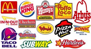
Think about the advertising panels and logos of McDonald’s, Burger King, KFC, Wendy’s, Pizza Hut. What do you find common among all these? One major similarity is the colour that they use. The science behind using these colours is called ketchup and mustard theory.
Scientists believe that both these colours have the ability to encourage viewers to eat. Also, colours are the fastest mode of communication for our brain. Yellow is a symbol of happiness, excitement, and cheer and red is an attention seeker causing triggers of appetite and hunger. Red makes us feel warm, loved and comfortable which is necessary for a good long meal. Yellow grabs our attention from a long distance and it also increases the speed of our metabolism.
Experts believe that combination of these 2 colours create the perfect combination of emotions and feelings to make people feel hungry and spend more time while having a meal.
Even if this theory is not 100 percent correct, companies do believe that there is something special about red and yellow which makes them use these colours. It is clear from the results that there is definitely a connection of colours in making us feel hungry. In the age of competing, brands use every possible tactic to attract customer and there is nothing bad about using the same colours if it effective for increasing sales.
From The Sun Online…
Ever wondered why the McDonald’s sign is red and yellow? The reason why might surprise you
Many fast food restaurants traditionally use the two colours because of the psychological impact they are believed to have on customers
REVEALED
By Hayley Richardson
12th September 2017, 10:52 amUpdated: 13th September 2017, 11:02 am
THEIR golden arches are famous around the world, but have you ever wondered why the McDonald’s sign is red and yellow?
You may have noticed that many fast food restaurants, such as Burger King and KFC, also traditionally use the two colours in their signage.
Apparently this is because of the psychological effect the two shades are believed to have on customers.
According to Karen Haller, a leading international authority in the field of applied colour psychology, the combination of colours have a powerful impact.
She explained: “Red triggers stimulation, appetite, hunger; it attracts attention.
“Yellow triggers the feelings of happiness and friendliness. When you combine red and yellow it’s about speed, quickness. In, eat and out again.”
Karen also pointed out that yellow is the most visible colour in daylight, which is why those golden arches catch your eye even when you’re a fair distance away.
She added: “The language of colour is communicated quicker to the brain than words or shapes – as they work directly on our feelings and emotions.”
Red triggers stimulation, appetite, hunger, it attracts attention, while yellow triggers feelings of happiness and is most visible in daylight.
Many McDonald’s restaurants have recently refurbished their stores to include more of the colour green, especially within the shop frontage.
According to Karen, the intention is to create a very different dining experience.
“Green elicits the feelings of nature; natural and environmentally friendly,” she said.
Other popular fast food joints also use red and yellow in their branding.
Other popular fast food joints also use red and yellow in their branding
More recently McDonald’s has incorporated green into its branding
“It’s no longer about rushing in for a quick bite to eat. You can relax, get comfortable, linger over a coffee.”
The Sun Online has reached out to McDonald’s for comment.